
How to design a SaaS dashboard people can actually use
A dashboard is not a collection of cards and charts. Its job is to explain the state of the system and the next useful action as quickly as possible.
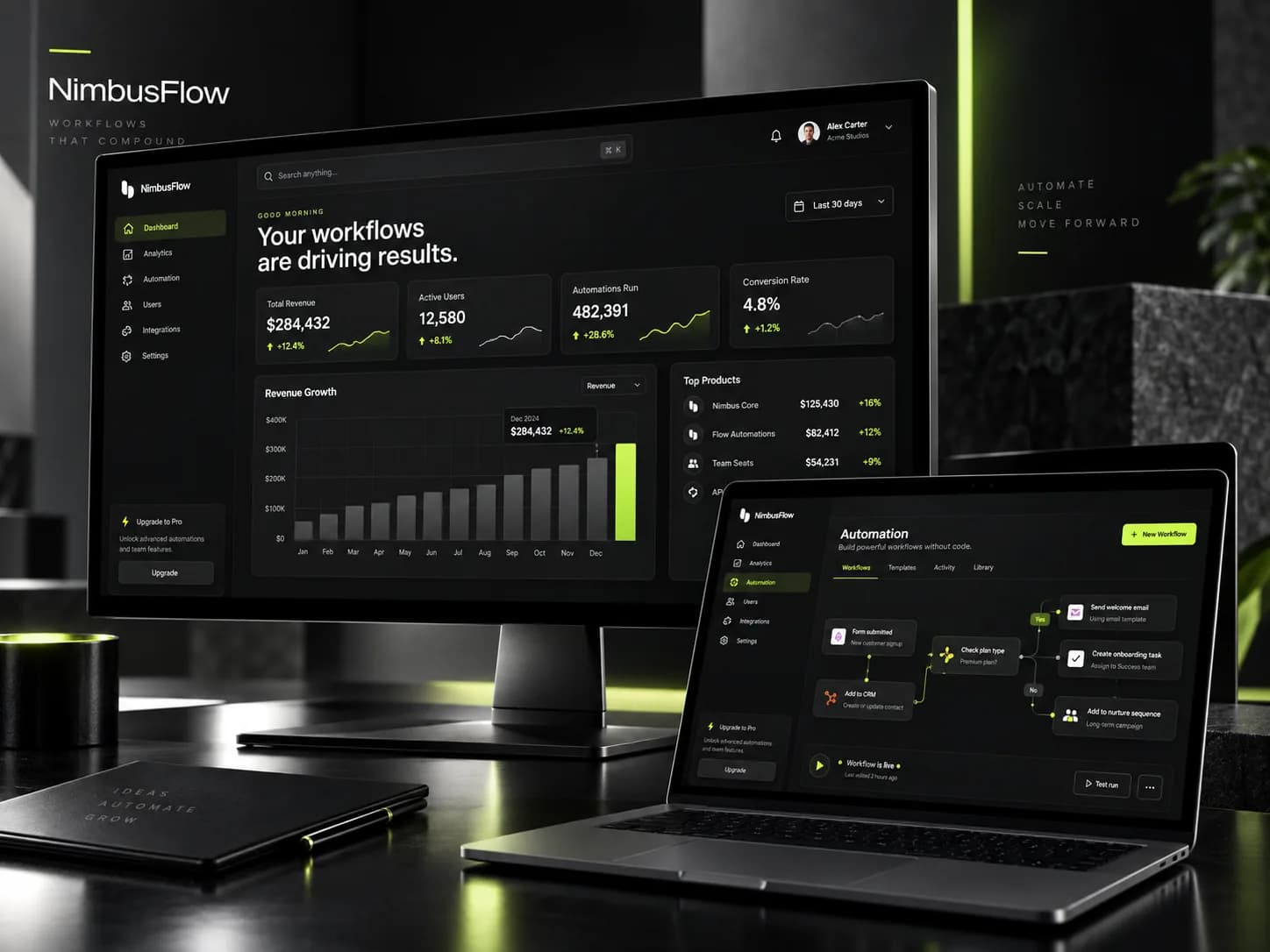
In SaaS products, information hierarchy matters more than decoration. The most important metrics and actions need to be visible without extra searching.
A consistent card system, spacing and typography reduce cognitive load. Users can quickly understand what is a number, action, status or secondary detail.
Automation builders and complex workflows benefit from progressive disclosure. The interface should show enough information for the next decision without exposing everything at once.
A premium SaaS interface is both beautiful and operationally fast. If an effect slows down the core task, it is not premium — it is friction.