
Why a premium website should never feel like a template
A premium impression does not come from one animation or an expensive font. It comes from a system: structure, rhythm, typography, imagery, motion and content.
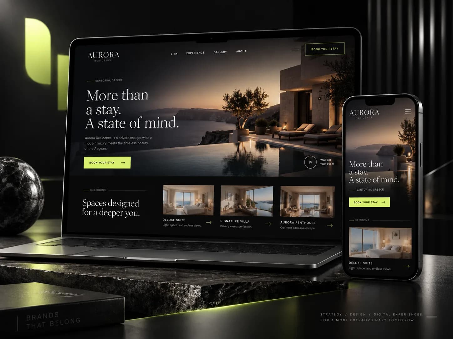
The biggest difference between an average and premium website is not the number of effects, but the consistency of the experience. Typography, spacing, imagery and micro-interactions need to speak the same visual language.
A strong premium website has focus. Users quickly understand what the company does, who it serves and which action matters next. That is why UX and content structure come before decoration.
Motion works best when it reinforces hierarchy and quality. Fast, subtle reveals, controlled parallax and precise hover states can elevate the experience without sacrificing performance or readability.
In the end, a premium website should feel like part of the brand, not like a pre-built product with a logo placed on top.